02
Fresh data that shows real patterns.
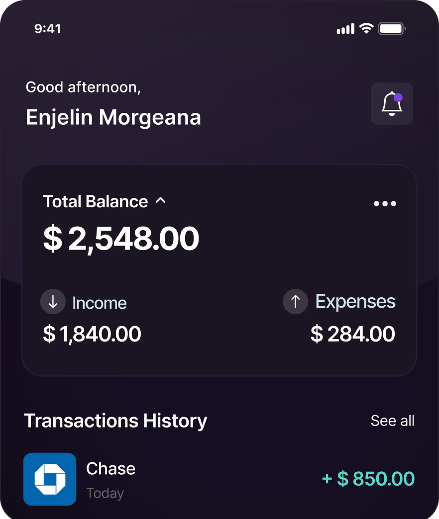
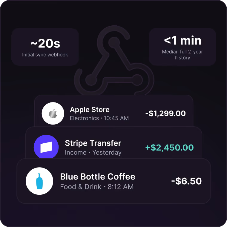
Webhooks fire when new transactions arrive or balances change. Real-Time Balances returns a current number on request. A user who opens your app at 9pm sees what they spent at 8:45. Your app stays live without a polling loop, and you don't have to build one.
Recency isn't enough on its own. Ninety days of transactions can't tell a user their heating bill spikes every January. Aggregator defaults are inconsistent and shallow, roughly 90 days from MX and six months from Finicity, with extended history sold separately. In Quiltt, extended history is a checkbox at the integration level. Turn it on and we attempt up to two years across providers, handling each one's separate premium history call for you.
Initial sync webhook fires in roughly 20 seconds. Median full two-year history lands in under a minute.
03
Enriched transactions from the moment accounts connect.
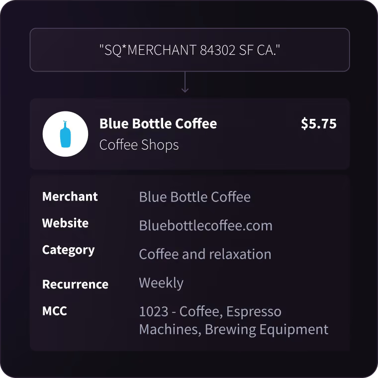
Raw bank data shows "SQ*MERCHANT 84302 SF CA." Enriched data shows "Blue Bottle Coffee, Coffee Shops, $5.75, recurring weekly."
Quiltt's enrichment partners (Fingoal, Ntropy, Pave, Prism Data) add categories, merchant names, logos, and recurring-charge detection. Accuracy lands in the mid-90s, meaningfully above what aggregators return on their own. Every API call gives you three shapes of the same data: raw from the aggregator, normalized by Quiltt, enriched by your chosen provider. Use whichever your feature needs.
Categories are yours, not ours. One customer's user worked at an insurance company and the aggregator labeled his payroll deposit as an insurance payout. That single row breaks a budgeting model. With Ntropy you feed us your own taxonomy and we apply it going forward, across your whole API or per individual user, so when a user corrects something the correction sticks.
04
Make data actionable, not just a pretty chart
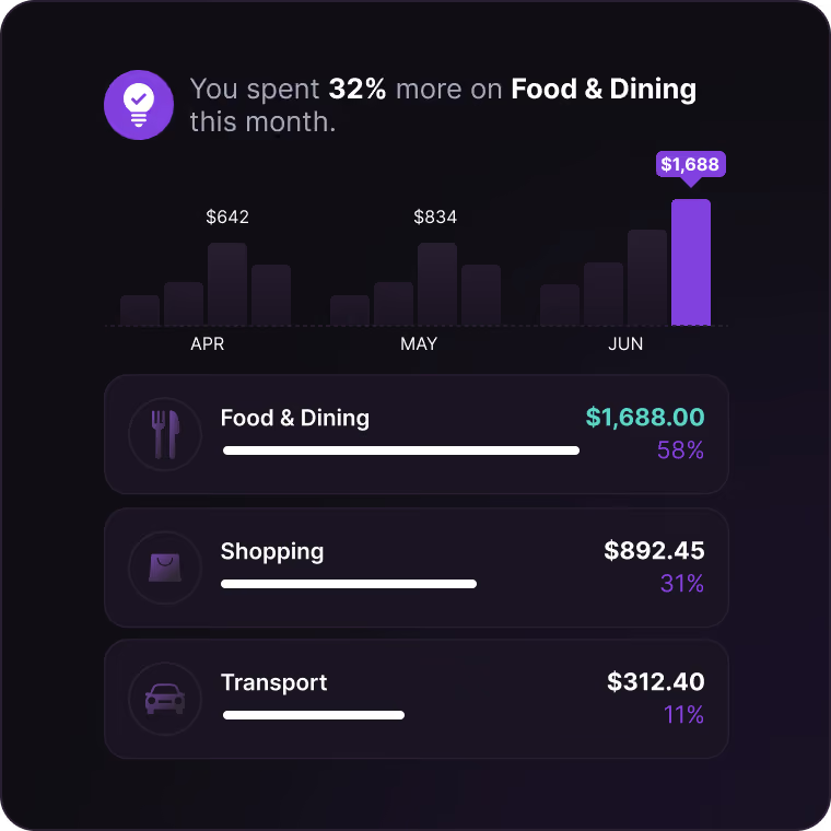
A spending chart is easy. A spending chart that's still correct in month nine is the actual product.
Coverage means the user's credit union shows up in search. Reconnect resilience means the chart doesn't flatline for four days. History depth means the January spike is visible. Enrichment means the row says Blue Bottle instead of SQ*MERCHANT 84302. Get those right and your insight layer works. Get them wrong and no amount of design saves you.
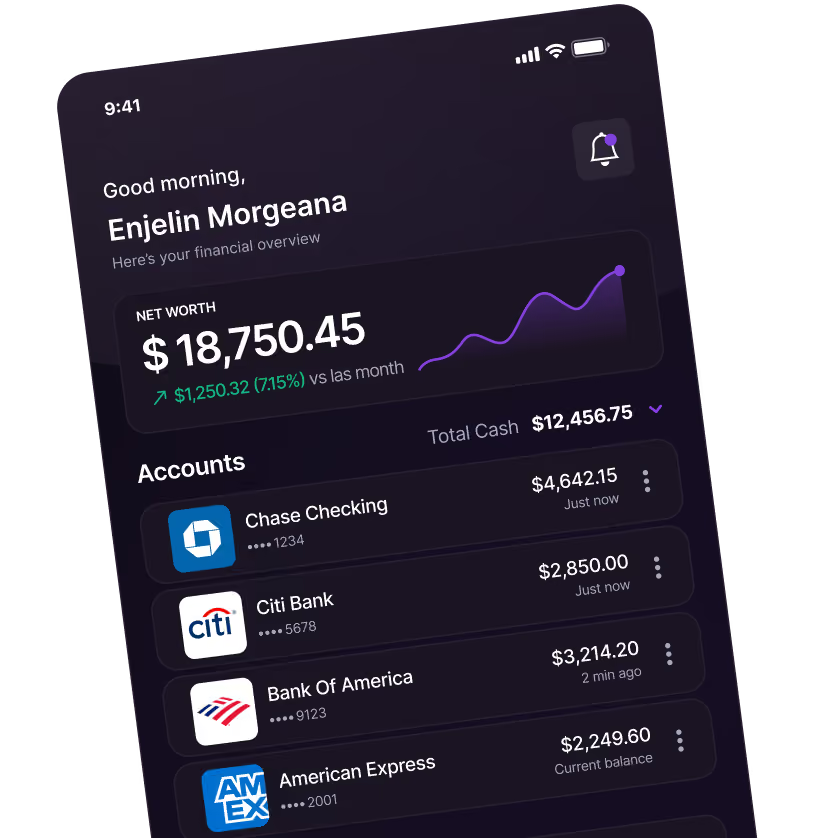
One more thing that matters for PFM specifically. Your users connect three or four institutions each. We bill per profile, not per institution, so engagement doesn't inflate your data bill.